As part of PNC’s new national retail strategy, there was a focus on our digital initiatives. One of the larger pieces of that was our online application experience. Since we were looking to expand our sales footprint to regions where there would be no physical branches, the primary way that a consumer would interact with us and get one of our financial products would be through our online application. The application process that was in production was severely outdated and a clunky experience that caused many users to just drop off. My manager challenged me to design an experience that could be completed in about 4 minutes or less.
TEAM |
TIMELINE |
| 1 designer | 6 months |
| 1 product owner | |
| 1 tech lead | |
| 3 engineers | |
| 1 qa analyst |
At the time, I was working as a designer on our consumer checking product team and took the project as an opportunity to step up and be the sole and lead designer. I worked very closely with the product owner, who had been working on the application for 10 years, as well with our main technical lead.
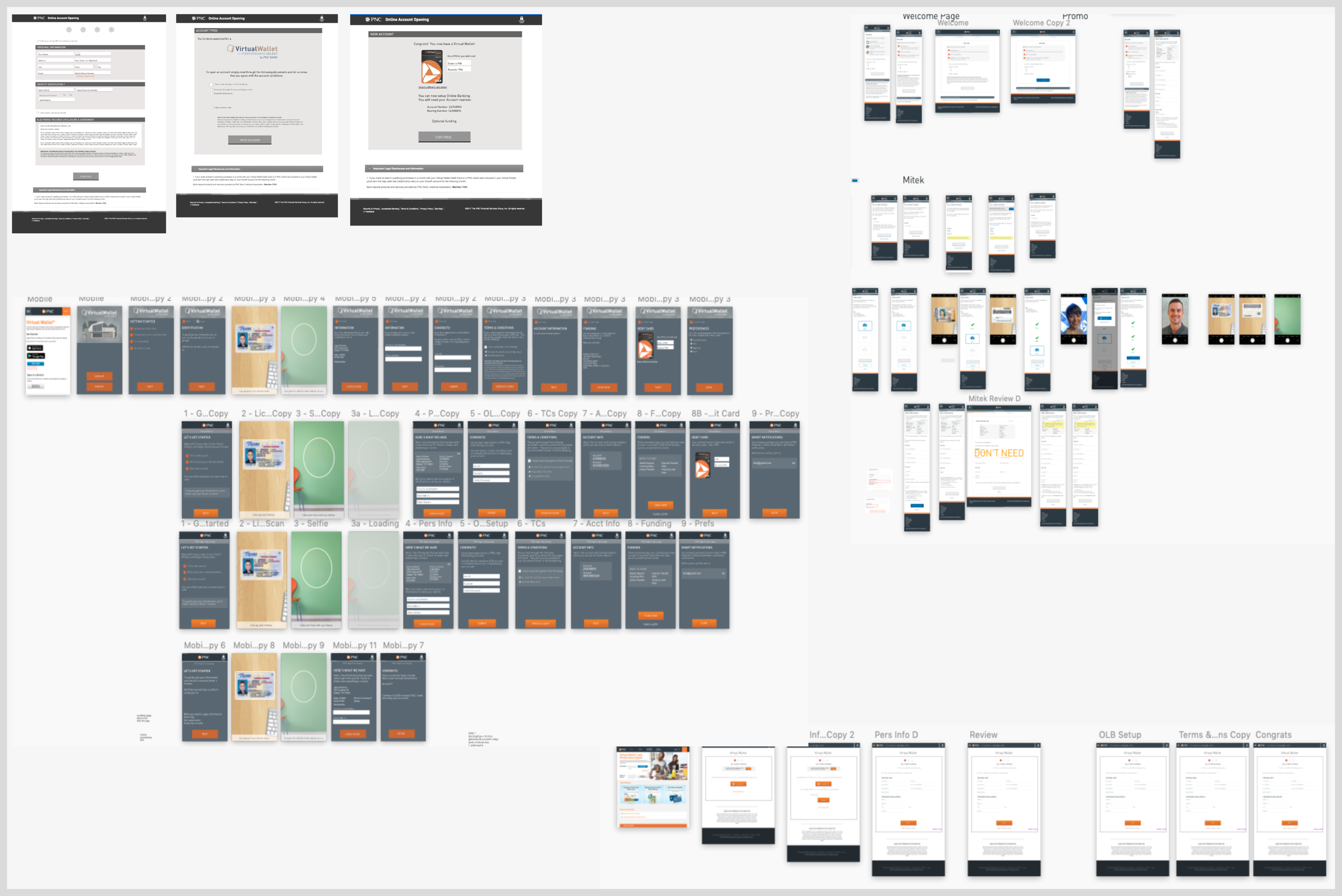
Since we had an existing experience, I wanted to do an inventory of any past research and analytics that were done to understand the various pain points. Also, since it was designed before cell phones became mainstream, I knew that the main use case for the application would be someone on their phone. The product owner had a wealth of insight and knowledge too that really helped as I started to dive in. As we were building this in-house and from the ground up, I knew that we had an opportunity to design and develop something that was more innovative and seamless user experience.
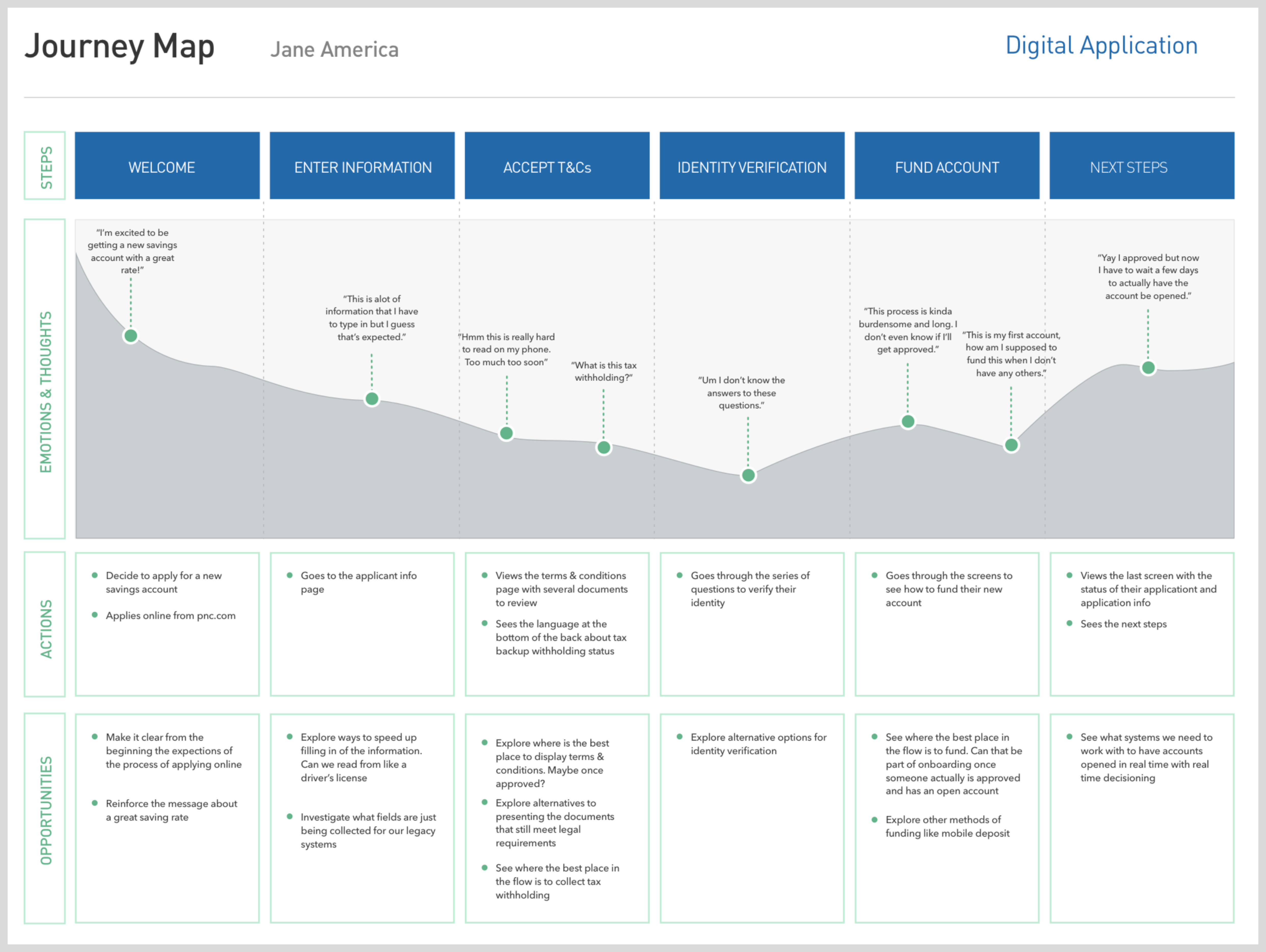
As part of the process, I mapped out the user journey to document the flow and see where we needed to improve the experience. I've always equated the application as similar to an online shopping checking experience. If things are confusing, people will just abandon the site. So I focused on having it as simple and easy as possible as we analyzed the experience page by page.
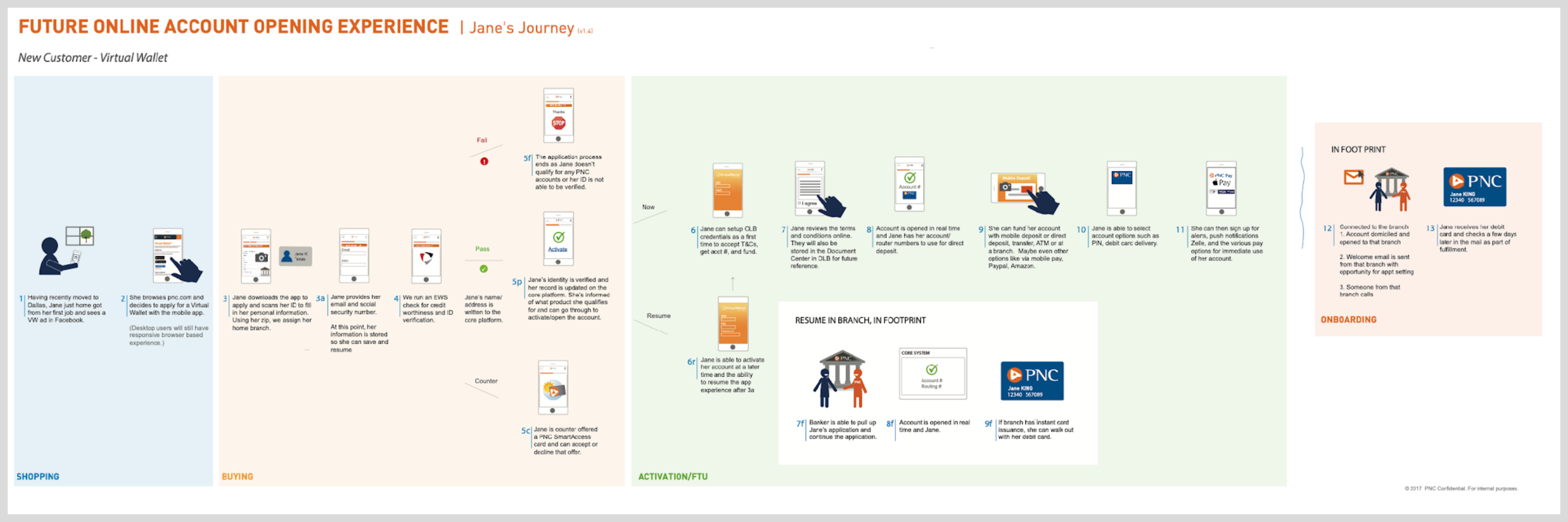
I also created a storyboard to communicate with various stakeholders what we were envisioning for this next gen application. There were numerous paper sketches before the wireframes and research around best practices for form design.
Given that this was a crucial initiative, I also wanted to make sure we had usability testing in our schedule and budget so that we would have feedback and signals early enough to pivot as needed. As the flow was getting refined and adjusted, I tried a varity of approaches for the user interface and ran them through usability testing as well as built out a few prototypes for demo purposes with stakeholders to get feedback throughout the project. At the time, our design system was started to get built and I took some visual direction from that team to also see how it could work for the online application.
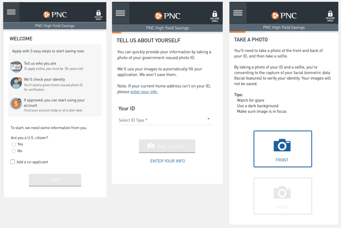
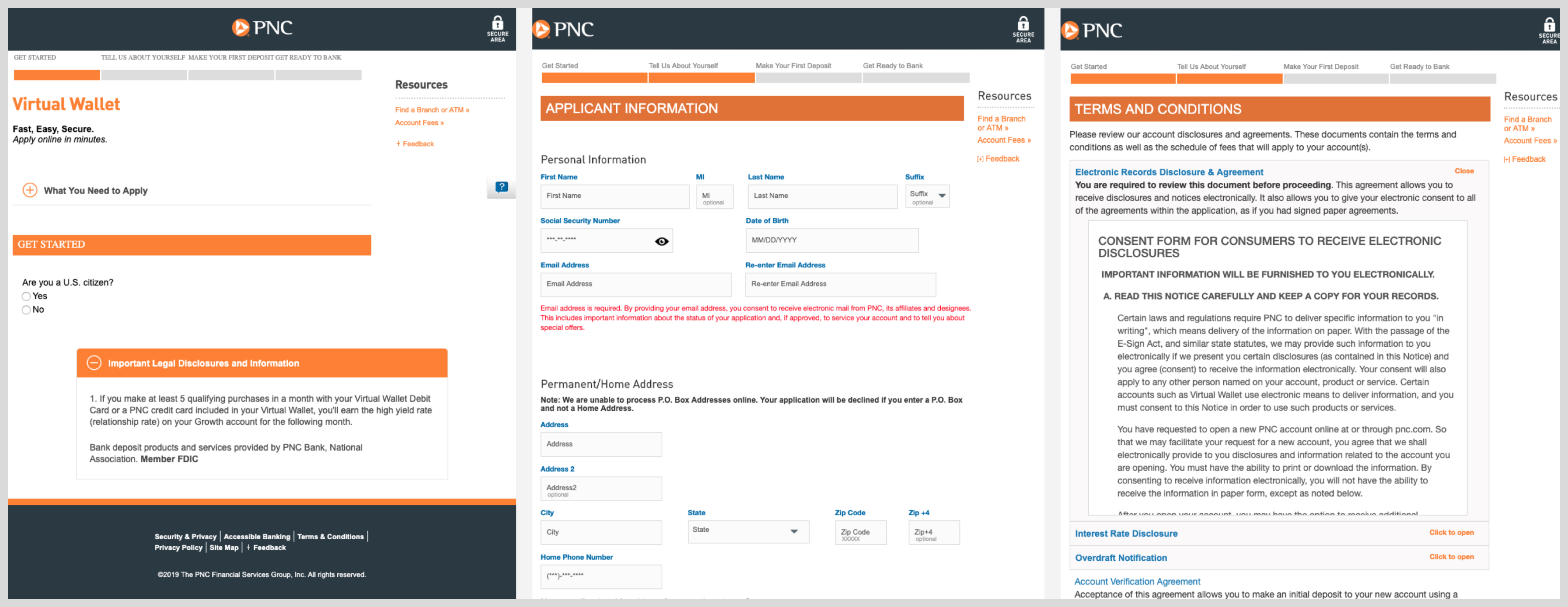
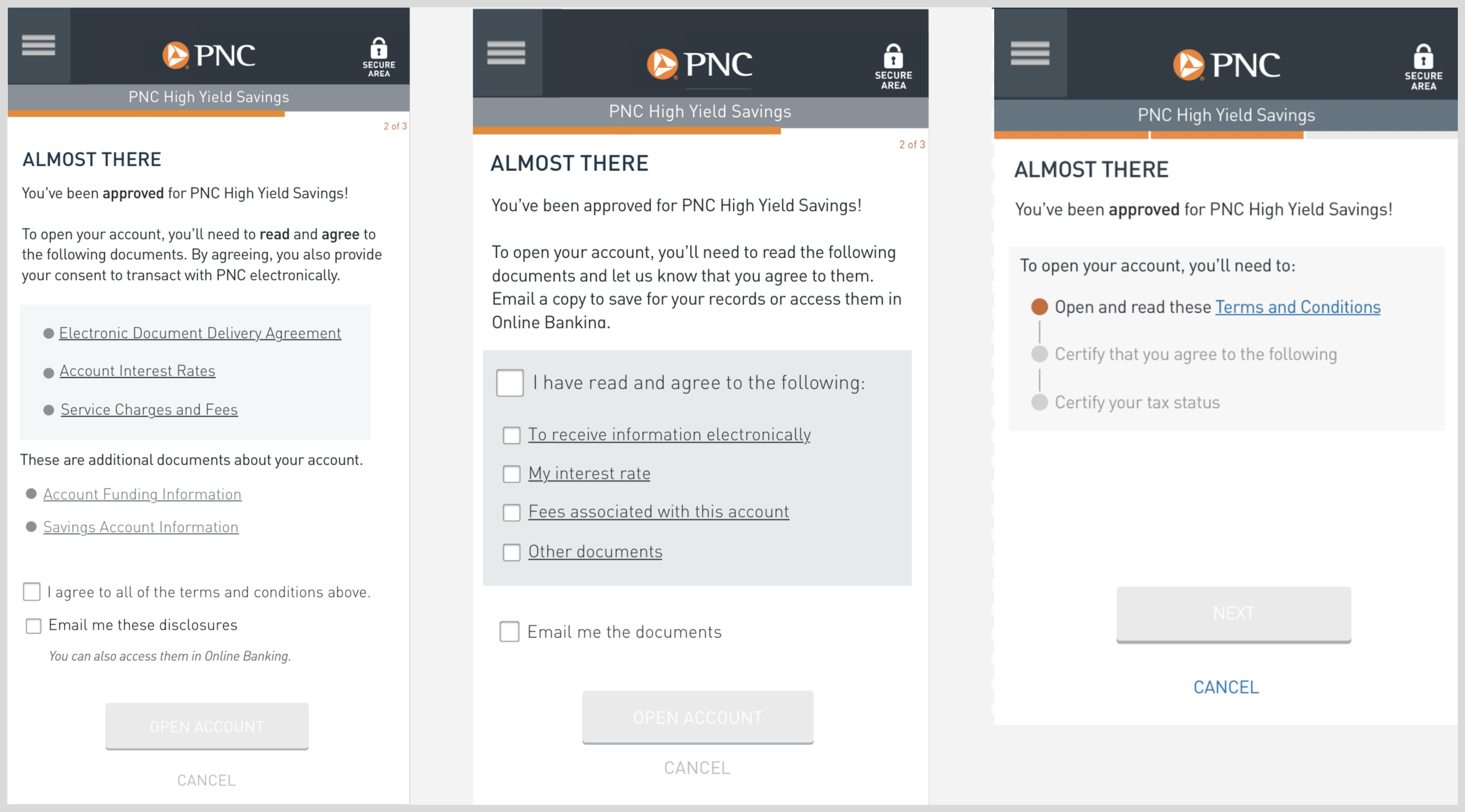
Analytics revealed a significant drop-off at the terms and conditions step, the second stage of the funnel, largely due to a confusing interaction that also wasn't optimized for mobile devices. I collaborated closely with our legal and compliance teams to fully understand their requirements for document presentation and the specific user actions needed for agreement. Based on their feedback, I designed several options and proposed a more streamlined user experience, using prototypes to demonstrate the changes. The final design, which I believed offered the best experience, was validated through usability testing.
For the final designs, I also had to incorporate new branding styles that were being released as well as validate every element for web accessibility. My goal was a clean design that allowed consumers to quickly flow through the application. As we neared production release, I had confidence in the launch as I had been doing usability testing throughout the project.
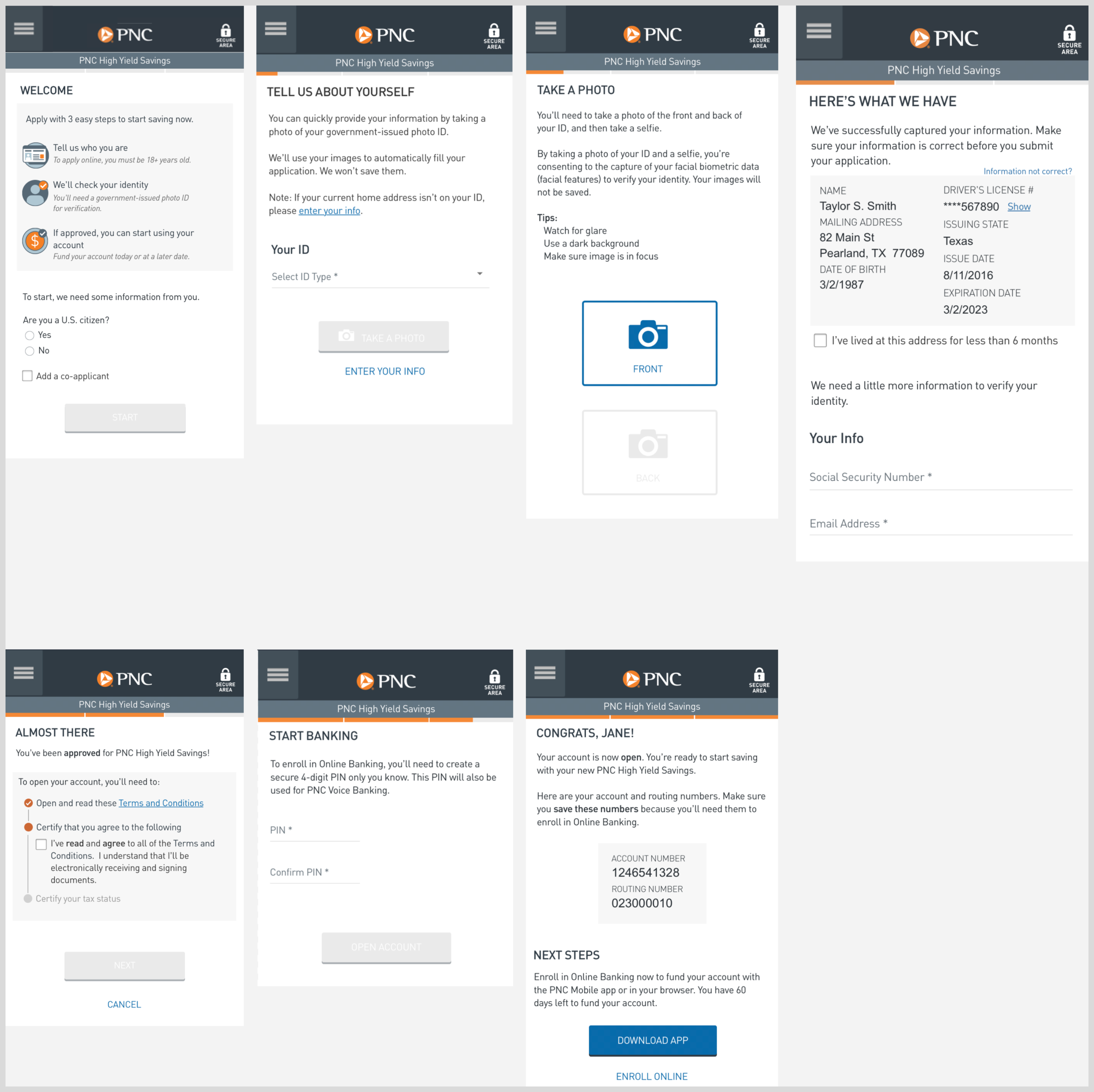
This project was a success as we saw an increase in our digital sales with the volume of applications growing from 3% to 26%. Through continual a/b testing, analytics, and research, we've refined various aspects of the experience to get people to successfully apply within 4 minutes, which was a 60% decrease in application completion time.