BACKGROUND
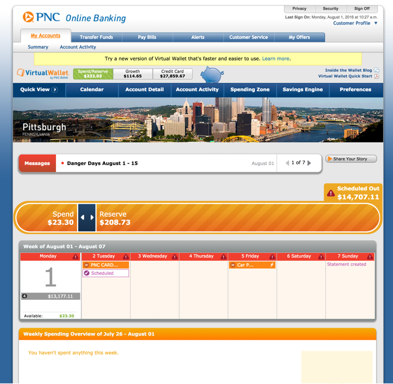
Launched as an innovative money management checking account in 2008, Virtual Wallet was due for a redesign. The goal of this project was to improve and update the product experience for our users so that they could achieve better financial wellness. We didn’t want to just give it a visual facelift, but to really understand the goals of our users and how we could best support them in our product.
I was on a team of a few designers and product managers. We collaborated quite closely and had several rounds of brainstorming, co-creation, and performing research together. Our team also was in the process of transitioning to an agile process and had a dedicated engineering team.
RESEARCH
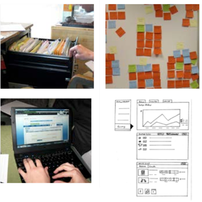
Since we had an established customer base, we were able to go out into the field and perform some contextual inquiries to see how actual customers were managing their money using our product. It was quite interesting to see how people were using Virtual Wallet and able to develop good financial habits. We also took a look at our product analytics to see how people were using Virtual Wallet, like how often they were coming and what features people were using.
From that research, our strategy was to modernize the interface and simplify the architecture to match more the mental model people had when it came to their bank accounts. There was enough stress with money and we wanted to make banking easier.
IDEATION
As we had uncovered pain points and areas of opportunity from our research, we then spent some time brainstorming several ideas individually and as a team. We had a better idea of how our users wanted to interact with our product and what goals they had since we actually had talked to users.
We consolidated this initial research onto several boards of post-its that helped guide our brainstorming as we wanted to determine the best way to redesign the structure and tools to best facilitate the sense of control of one's finances. We focused on some popular use cases to really simplify the flow.
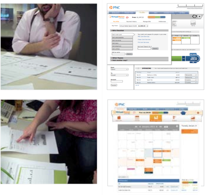
With a large user base for this experience, I wanted to ensure that the changes we were making would be well received. We ran a few rounds of testing with customers to get their feedback and thoughts. Some of it was even done with some paper prototypes just so see conceptually what really resonated with users. We wanted to make sure that nothing was confusing or more difficult for people to use.
FINAL SOLUTION
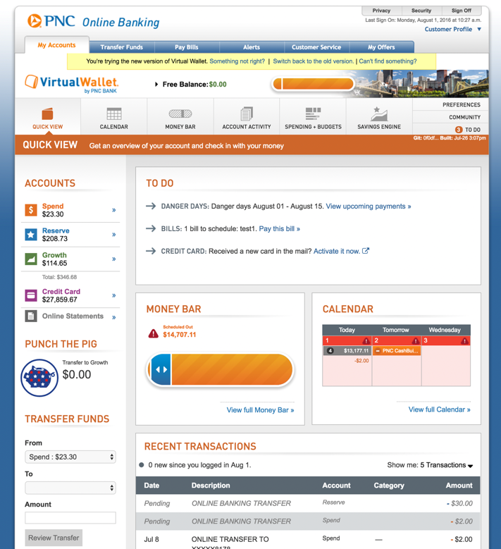
In the final designs, we worked to simplify the navigation as well as the structure of the product. We also worked on making more important information easily accessible. One feature we modified was our Messages Bar into a To Do notification area to make immediate actions clearer.
As we implemented the changes, we were able to see our scores for our online banking experience increase as well as greater feature usage through analytics. In some follow up surveys, we also heard how the redesigned experience was landing positively with customers and how they appreciated having the flexibility to use Virtual Wallet in the way that they wanted.